The Dining Room
Chapter 13: The Art of Innkeeping
In 2006 if you wanted to give a generous assessment of the Sugar Hill Inn’s dining room you would see a delightful breakfast room. In the morning with windows on three sides, the room is bright and sunny. The room had natural wooden tables and simple schoolhouse chairs. The tables were topped with woven place-mats and the servers were wearing colorful “Little House on the Prairie” aprons. If the room could only speak it would be inviting you for the best pancakes and sausage in town along with genuine local maple syrup and lots of hot coffee. The inn has always been known for its delicious breakfasts. If we were just a simple old fashion B&B and not a full service inn with big plans for the future, a little fresh paint would have been all that was needed.
However, my critical eyes were focused on two huge air conditioners cut into the wall. In the late 60s I am sure that it was cool and reassuring technology but by 2006 these dinosaurs were blowing only hot air. Also the over powering flowered wall paper from the 70s was showing its age. Norman Rockwell prints were strategically hung to hide tears and holes in the wall paper. There was also something about the design of the tables that made the room look like a German Beer Hall.
Carol, our interior decorator, was in charge of developing a plan to redo all of our public rooms on the main floor. It was our thinking that first impressions count and therefore we would immediately focus on the rooms that everyone would see. Carol’s expertise was in the area of residential design. Restaurant design was an entirely different ball park. With so many projects under way we decided that we would replace the worn wall paper and redo the lighting. Carol selected very elegant wall paper and Hubbardton Forge lighting. Having these fixtures throughout the main floor tied our common rooms together. Hubbardton Forge lighting is hand made of wrought-iron in Vermont and being local was important to us.
 We also tried to hide the beer hall tables under tablecloths. While I dislike this saying it totally applies to this situation. It was like putting lipstick on a pig. It would be another year for us in figuring out our next step.
In 2007 I was attending a meeting of the New England Inns and Resorts Association at the Mount Washington Hotel. The Architecture & Interior Design firm of Truex Cullins had a table at the meeting displaying beautiful photos of their hospitality projects. A gorgeous cottage caught my attention. We were currently in the planning stage for the Dream Cottage and I momentarily considered bringing them in on that project but we were too far ahead with the planning and that would have delayed the project.
Several months later at another meeting of New England Inns and Resorts Association at the Bethel Inn, Kim Deetjen, interior designer and principal of Truex Cullins, gave a thought provoking presentation on green design. At the meeting I told Kim about our dining room and inquire if this project would something Truex Cullins would be interested in. Being relatively new to the restaurant business I felt that we need some expert help. How big should the tables be and how much space should be between tables? How do we create that elusive feeling called atmosphere? How do you decorate a traditional country inn dining room tastefully and standout from the crowd at the same time? A few weeks later Kim and her team of designers came to see the inn. Besides from measuring every square inch of the dining room we also spoke about our goals for the inn and showed them our recently completed renovations such as the tavern, library and Dream Cottage.
In building the plan there were three constraints. We would work with the current wall paper and lighting since they were still very new and the room design would be flexible enough to be reconfigured for special events such as weddings. Unlike most residential interior designers that make their money by buying at wholesale and selling at retail, Truex Cullins would receive an hourly rate for consulting and the furniture would be at cost.
We received a very detailed plan via mail that included fabric samples, photos of furniture, layout drawing and the design for a custom built wine cabinet. An appointment was set up for us to visit their offices in Burlington to discuss the plan. Looking back on the plan I have to give them a lot of credit for understanding both who we were and where we were going. They combined a traditional design with innovated ideas, sophistication, comfort and fun. When you are paying a consulting fee you are looking for outcomes that you could not have achieved on your own and they delivered with great ideas.
Prior to our meeting I was told that a newly hired employee would be coordinating our project. Val (Executive Chef), Nancy (Val’s wife), Theresa (Former Assistant Innkeeper) and I began our meeting by taking a tour of the facility. It was very impressive. They had catalogs from thousands of suppliers. There was nothing that they could not get. Following the tour we sat down at a conference table with the designer appointed to coordinate the project. We began by just informally talking but I assumed that she had a formal presentation for us that would logically take us though the plan. As someone who had worked years in the corporate world I was ready for a PowerPoint. Instead the meeting turned into an unorganized question and answer session. Although I loved the concepts and vision I had concerns about the person they had put in charge.
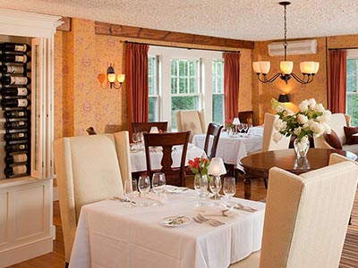
The plan included a number of different seating options for our guests including high back chairs and loveseats. All the tables had attractive wooden legs. They also designed a wine display that would be custom built for us. Not only would it display our growing selection of wine but would also hide the kitchen doors and the back side would provide a work area for our servers complete with glass storage. A beautiful handmade wool rug would show off a center table. The only thing that disappointed me about the plan was the recommendation for art work. With so many cool galleries in Burlington I was expecting something really interesting. At the end of the meeting a few tweaks to the plan would be made and then the purchase order would be sent over to me to be sign.
When what should have been the final plan arrived I showed it to Theresa, the assistant manager at that time, for her input. She said that it looked crowded and was concern that the servers would have trouble getting around the room. At first, I discounted her opinion, after all Truex Cullins were hospitality experts, these details were why reason we hired them. Latter we would learn that although they had built many very impressive hospitality projects, we over estimated their restaurant experience. Over the next week or so I went out to eat several times. Everywhere I went I would measure the table. I also fully set our tables with dishes and glass where to see how large of a table it would take for our style of fine dining. I reported back my thinking to Truex Cullins and several new drawing were produced but we were not getting anywhere. It was like being in a New York City taxi caught in traffic with the meter ticketing. I complained to Kim and she assigned a senior person to oversee the project and removed some of the nonproductive hours from the bill. Eventually all the details were worked out and the paper work was signed and we waited for the big day when everything would be delivered.
The wine display arrived a few days ahead and was assembled on location. The craftsmanship was absolutely beautiful. We are still in love with that piece years later. The day the furniture came, Kim was onsite to see that everything was perfectly placed. We set the room for dinner and Kim made flower arrangements for each table. The room looked perfect.
Over the next few weeks we did discovered some things that we needed to adjust and some design quirks that we just needed to live with. We discovered that if we sat guests at the center table the room was too crowded for the servers to maneuver so we pulled the chairs from the table and use it display a fresh flower center piece. The location of a couple of tables had to be slightly adjusted because the center carpet runner impeded the free movement of their chairs. We also discover that our high back chairs did not work as well as we would have liked with the table bases but this is something we have learned to live with.
On a trip to Quebec City back in 2008 Karen and I found the perfect painting for above the fireplace. This was the first expensive painting we purchased as a couple.
Overall I would have to say that we have been very pleased with our dining room and I can’t think of any inn of our size with a nicer restaurant. Also years later, I can say that the design, fabrics and furniture have all stood the test of time.
Want to know more? Read our book “Sugar Hill Inn Art of Innkeeping.” Available from Amazon and Barnes and Noble.

